
Fitch Learning – UX and UI Design Challenge
On October 2018, I was invited to develop a concept to solve the Topic Tree design issues for Fitch Learning, a fintech company specialised on e-learning courses for the financial market.
The Challenge: Redesign the Topic Tree

The Issues
- As a user I cannot see the title of Study Sessions, Readings and Concepts that are not currently selected, so it is difficult to get a quick view of what is covered in this Topic.
- As a user I am not able to see how much content of a Study Session, Reading or Concept that I have covered so I do not know where there is more content that I have not viewed yet.
- As a user I am not able to see how well I am doing (proficiency) in a Study Session, Reading or Concept so I do not know which areas I need to do more work on to improve my proficiency
- The ‘list of atoms’ that are linked to each concept do not easily represent what is contained inside the concept, and how much work or time I will need to put in to learn that concept.
- When there are many concepts or atoms I am forced to scroll down the page to see what is selected; when I do this, I can no longer see what Reading or Study Session I am currently looking at as this information is at the top of the page.
- Users find it difficult to see that there is a ‘Question Bank’ feature that allows them to open up a quiz player and answer practice questions. This is a key feature that learners look for.
- The current topic tree will need to work responsively to a smartphone screen one day!
The Solution: User Intelligence Dashboard
 A customer intelligence dashboard can be used by users to see a quick overview of their course – equipping them to study in a more personalised fashion. With a modular and responsive layout, the user has access to their course in different formats and is able to study wherever they are. Analytics can be brought in to show the interactions the user has with the website, how well they are doing in their course and the pain points of it, so they know where they need to focus to improve their results.
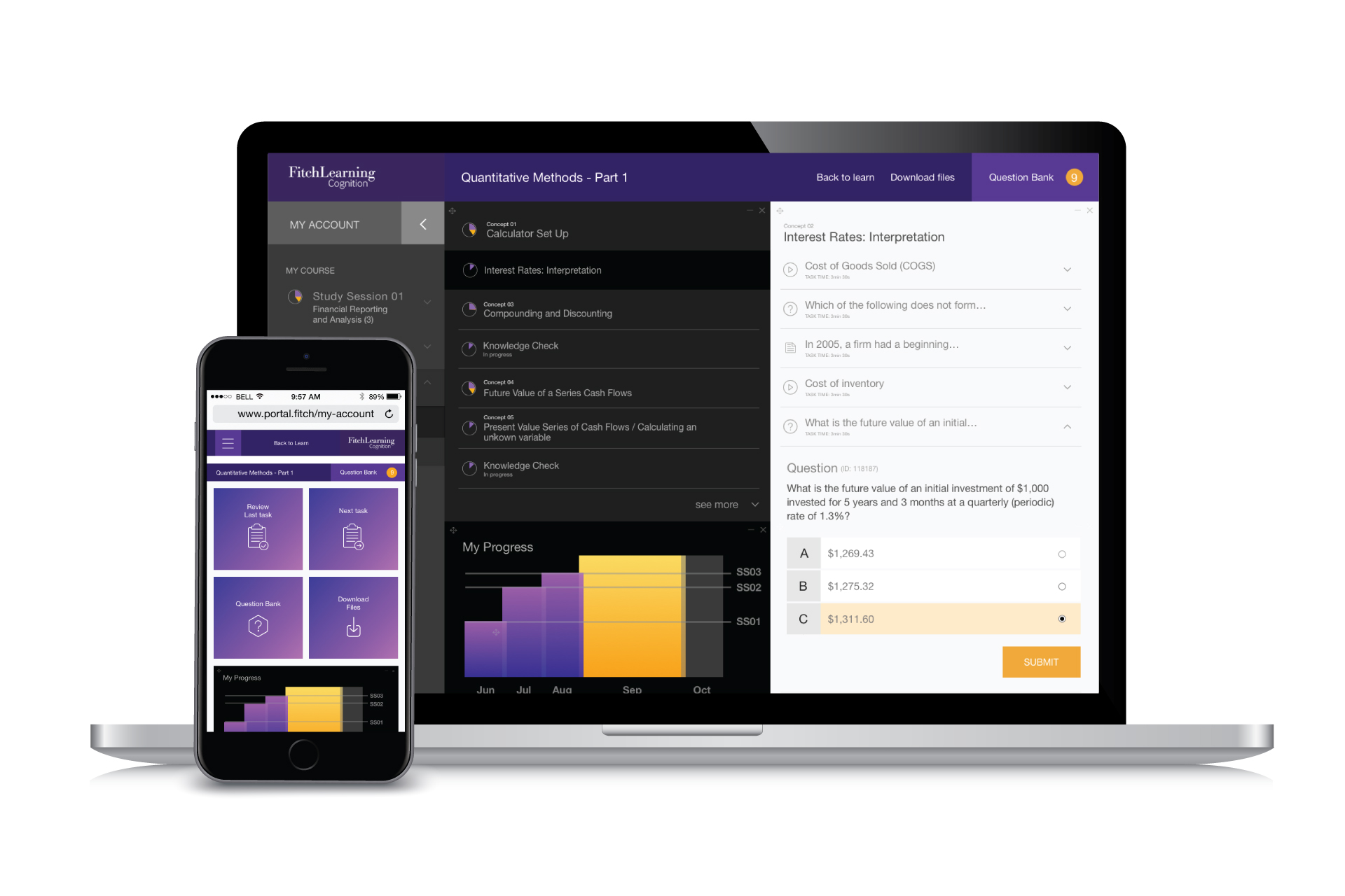
The user intelligence dashboard main menu is divided between the “My Course” and “Profile” sections. In the “My Course” section, the user has full visibility of the Study Sessions from the specific topic they are studying. Under the “Profile” section the user can see all their personal details, messages, calendar, studies analytics and help and advice.
The progress wheels display how much of each Study Session, Reading and Concepts the user has covered and how well they are doing and where they need improvement. When the user hovers over the it, they get a message “Would you like to go to the Questions Bank?” – with a link to the Bank.
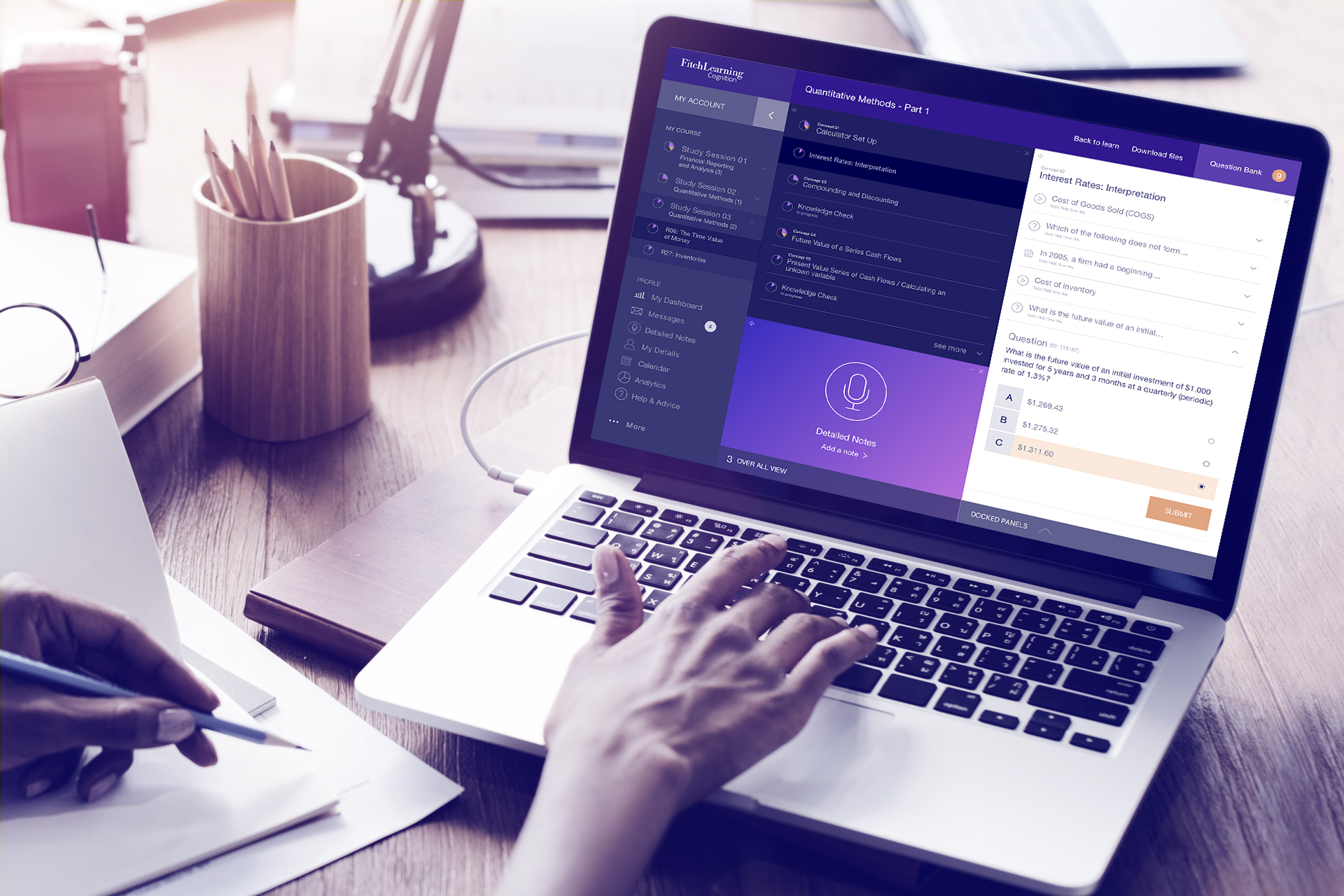
The user can also personalise the blocks displayed having, for instance, an over all view of their progress. The different dashboard sections scroll up and down independently, so the user can navigate without losing track of the over all view of their studies.
When the user clicks on a Study Session, chooses a Reading, navigates to the Concept section and chooses a Concept, a list of multimedia studying materials is displayed (atoms) and they can choose which materials they are going to study next, knowing how much time each one will take.
The user can move around, minimise or close the modules, personalising their dashboard view. They can also choose to record notes using the “Detailed Notes” module, making their studies more personalised and complete.
The Mobile Version
 When the user accesses their course using their cellphone, they can see a modular highlight for easy access: “Review Last Task”, “Next Task”, “Question Bank” and “Download Files”.
When the user clicks on the main menu burger icon, the menu appears from left to right. A similar animation happens when the user clicks on one of the Readings, but this time the entire Concepts screen takes over for better visualisation / interaction.
The Concepts list can be quite long, so it is recommended to show a few Concepts at a time (and when the user clicks on the “see more” link another 7 are displayed, i.e.) or another suggestion would be categorising the Concepts, nesting them on a dropdown menu.
When the user clicks on one of the Concepts, the Atoms list covers up the entire screen (with the same left to right animation) to better display the questions, videos and reading content.
The user can see the progress wheel showing their progress on each Concept and when clicking and holding it for a couple of seconds they get a message “Would you like to go to the Questions Bank?” – with a link to the Bank.